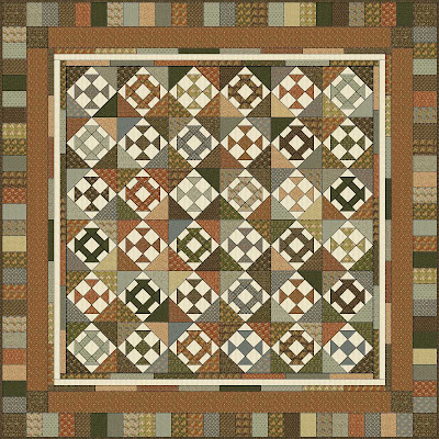
OK, folks, it's voting time again! (Gee, what would I do without the collective brain power of the blogosphere?)
Here's the deal: I can't decide on the border design for this quilt. I started out enlarging the design I used for the previous gift quilt, using a Arnold's Attic Fat eighth bundle and a fat quarter bundle of Arnold's Attic wovens (gorgeous,BTW). I started out with this idea, but when I laid it out on the floor it looked too dark:
 I know husband thinks so too, even though he said it was pretty, because he doesn't like the darker, muddier colors like I do. So I started to work on alternate designs to lighten up the look. I came up with this:
 And this:
 And this:
 And finally this:
 EQ and a hyper-active imagination are a deadly combination! Now I'm stuck with five possibilities and I can't decide. I like them all, you see. I'm most puzzled about using the light neutral on the outer border of the last design. Does that look like the quilt just "drifts off" or does it have a complete looking finish, if you get what I mean? The binding will be a brown mono print, if that helps.
 FYI, the piano key border pieces finish at 2 1/2" x 5", so some of the EQ representations show them too wide, but you get the idea.
I'm open to suggestions. Still making the blocks in the center so I have some contemplation time. What would you do?
Addendum: The more I look at them, the more I'm leaning toward number 4. Help!

4 comments:
Hiya Jan!
Your quilt is quite wonderful and so are those ginourmous tomatoes!
My favorite border would be #3 because it introduces the lights to balance the center, and yet it goes back to the deeper tones to give definition. Also, I am a practical woman who worries that very light outer borders will show every speck of dirt when being used.
Vic in NH
I agree with Vic in NH. My eye is drawn to the light inner border.
I think #2 is just right: it adds a wee bit of lightness to the busy borders.
4 is my favorite, but 5 can work too - use a dark binding!
Post a Comment